In this article I introduced a tool on how to create choropleth maps in Google’s Data Studio. I was really chuffed with choromap, but it soon became apparent it wasn’t sustainable for certain data sets. Take time series, geospatial data sets for example, say where you have a metric per day, per region. In the original choromap approach each row of your data set would have to have the geometry information needed to plot. This is problematic for two reasons:
- Geometry information within the raw data increases your file size. With time series data the amount of rows translates to t * a where t is the number of time series steps and a the number of areas. Essentially we only need the area information for a but choromap forces us to increase t fold. This is a waste of computation and storage.
- D3 is essentially taking all those layers of the same geometry and stacking them. This again is a waste of computation.
Instead of having the geometry information within the data, a better approach is to have the geometry information separate and combine the two. This is what choromap-lite does (click for Google Data Studio example report).
1. Method
Data Studio doesn’t allow the user to load data externally. This means we cannot host geometry data externally and load it into our D3 code — boo. Instead all the information must be passed directly to D3 using Data Studio. Whereas before we used the DATA dimensions to pass through the geometry information, here instead we rely on ingesting the geometry in the STYLE tab. As we don’t need to combine the data prior to data ingest, this process is much, much easier. All we need is our structured data file, which comprises at minimum the following:
- An ID for the area (e.g. 1, 2, 3)
- A name for the area (e.g. The Place, The Good Place, The Bad Place)
- A metric for the area (e.g. review: 3, 5, 1)
id | name           | review
1  | The Place      | 3
2  | The Good Place | 5
3  | The Bad Place  | 1
You could also include a timestamp for time series data sets, and additional metrics.
For plotting the geometries we need a GeoJSON file with a CRS (Coordinate Reference System) set to WGS84. In the properties field of the GeoJSON object there should be:
- An ID for the area
- A name for the area
{
“type”: “FeatureCollection”,
“name”: “some_polygons”,
“crs”: { “type”: “name”, “properties”: { “name”: “urn:ogc:def:crs:OGC:1.3:CRS84” } },
“features”: [
{ “type”: “Feature”, “properties”: { “id”: “1”, “name”: “That Place”}, “geometry”: { “type”: “MultiPolygon”, “coordinates”: [ [ [ [ . . .
As you can see, it’s then a simple case of joining the data and the GeoJSON based on the ID.
2. JavaScript Join
Whilst the rest of our code remains similar to choromap, choromap-lite uses a JavaScript method to combine the data and geoJSON:
geojson.features.forEach(val => {
  let { properties } = val
  let newProps = new_data[properties.id]
  val.properties = { ...properties, ...newProps }
  if (typeof val.properties.met === "undefined") {
    val.properties.met = null
  }
})
In essence, this takes the var named geojson, which is our GeoJSON object, and then for each geometry it appends our DATA metric to the object. Nice and easy*.
*There are hidden steps in the code to turn all field names in properties to those required above.
3. Using in Data Studio
To use choromap-lite import it into your Data Studio report click custom visualisations and components and select choromap-lite, or if it isn’t there:
- click Explore More
- click Build your own visualisation
- in the manifest path type gs://choromap-lite/
Then, to get this to work in Data Studio all we need to do is paste the GeoJSON text into the STYLE tab field named Input GeoJSON. Below this are two boxes where you enter the ID and name of each geometry within the GeoJSON object. For example for:
Input GeoJSON
{
“type”: “FeatureCollection”,
“name”: “some_polygons”,
“crs”: { “type”: “name”, “properties”: { “name”: “urn:ogc:def:crs:OGC:1.3:CRS84” } },
“features”: [
{ “type”: “Feature”, “properties”: { “id”: “1”, “name”: “That Place”}, “geometry”: { “type”: “MultiPolygon”, “coordinates”: [ [ [ [ . . .
The ID field would be id and the name field would be name.
In the DATA tab the top dimension should be the ID within the data set that links the data to the geometry ID, and the bottom dimension should be the name that links the data to the geometry name.
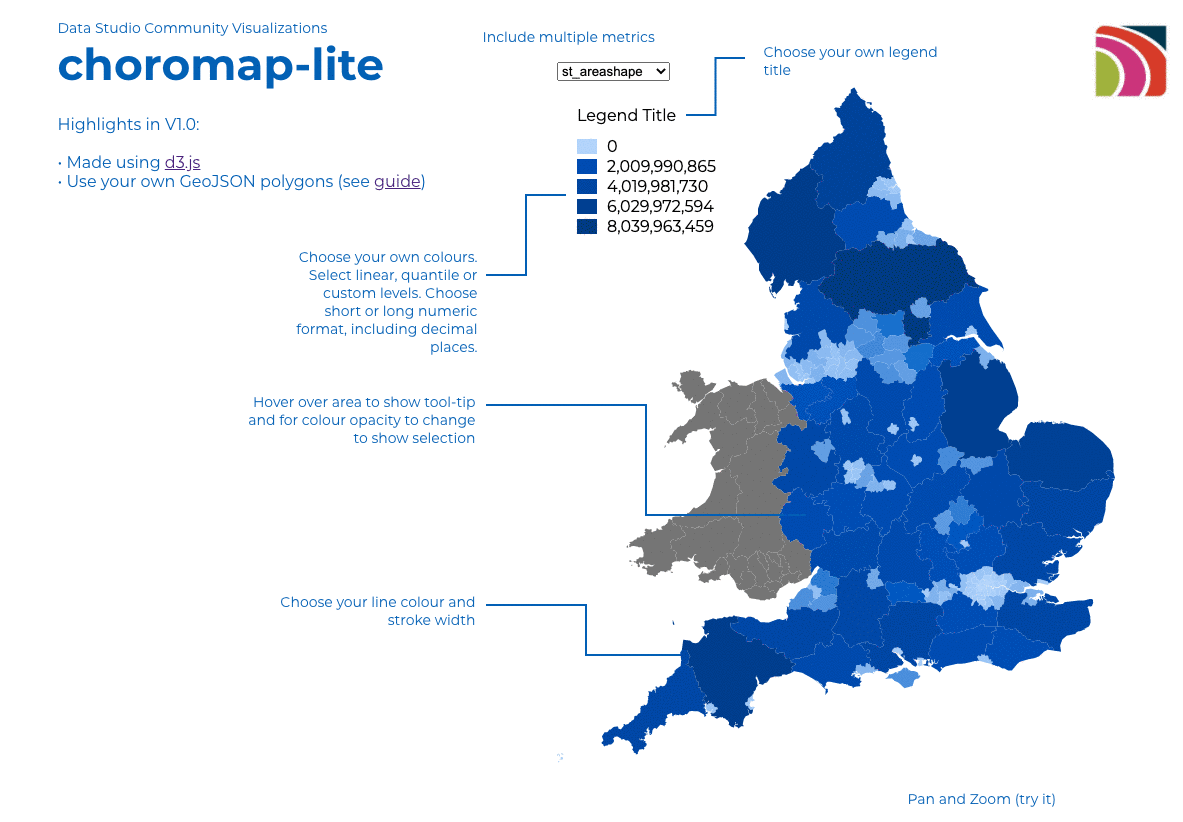
You can then select up to 3 metrics you want to plot. By default the top metric will plot, but the user can use the dropdown box to choose the metric they want (new feature, not in choromap). In addition, you can zoom and pan choromap-lite!
Below is an example of it in action. Note, after you paste the GeoJSON in STYLE you’ll need to refresh the page.
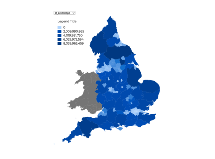
An example of the output from using choromap-lite
And that’s it…just check out the STYLE tab for aesthetics.
Thanks for reading.
4. Known Limitations
So, choromap-lite is super good at doing a lot, but if you throw it some mega-big GeoJSON (10MB+) it’ll probably crash your dashboard. For large, complex geometries it’s probably best to use the original choromap tool. If you have time series data though I do recommend choromap-lite, it’ll save on BigQuery costs if you use them; just simplify your geometries a little first.
This post has also been posted to medium.