Over the past few months I’ve been using Google Data Studio in my role at the Data Science Campus, Office for National Statistics. Having used data visualisation tools like Shiny, D3 and Dash to create bespoke dashboards in other projects I did groan when asked to use Google’s late entry into the dashboard market. Things got off to an amicable start when using the built-in line and bar chart tools; however, there was a noticeable lack customisable mapping tools in Data Studio. Ok, so it isn’t fair to point the finger just at Google in this market, because as far as I can see only Tableau offers a decent mapping capability. Even Google’s latest acquisition, Looker, seems to be limited. It’s just that after using libraries such as leaflet, D3 or deck gl, I was a little disappointed that Google would not have ported their geo-based infrastructure over to their Data Studio product. Credit to Google though, Data Studio is free, whereas others in the market are not.
Currently, at the time of writing, Google Data Studio only has two mapping tools: Geo Map and Google Maps. Geo Map allows for the creation of choropleth maps at country and sub-country level. For the US, this is US and state level. For the UK, this is UK and devolved nation level (England, Wales, Scotland and Northern Ireland). Choropleths cannot be created for smaller areas than these. The Google Maps tool in Data Studio allows for the plotting of Bubble Maps, whose centroid can be tied to areas as large as a country, or specific latitude and longitudes. Currently, there is no ability to visualise polygons in Google Maps in Data Studio, meaning that choropleths cannot be created.
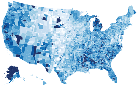
What we really want to be able to do in Google Data Studio (source: https://cartographicperspectives.org/index.php/journal/article/view/cp81-butler/1437)
Thankfully, Google haven’t shipped Data Studio as a closed product. Their intention seems to see how others use it and are willing to received feedback. In line with this, they allow data visualisation enthusiasts to create ‘community visualisations’. The only community visualisation mapping tool currently on offer is r42’s hexmap, made by Ralph Spandl. It’s an excellent tool and will definitely be useful for visualising metrics of dense point data. However, no one had cracked (or found the need to) custom choropleth mapping in community visualisations as of yet.
Here, I present a new community visualisation tool called choromap that creates choropleth maps based on user-created polygons. Here is an example of choromap in action in a Data Studio report.
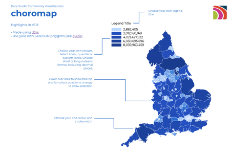
Choromap allows the user to choose the boundaries they want to visualise. Here are Counties and Unitary Authorities for England, UK.
1. Data: Fitting a square peg in a round hole
The first challenge was to get Google Data Studio to recognise geographical data. To start, Google Data Studio does not recognise BigQuery GEOGRAPHY data. A side note here, BigQuery GEOGRAPHY data from public data sets does not work well in choromap even after converting it to GeoJSON, see the Known Limitations section of this post. All geographical data must be loaded into Data Studio as a STRING. Here, we need to create a STRING GeoJSON type data set, save to a CSV file, which can then be read into Data Studio through one of its many ingestion methods (Cloud Storage, Google Sheets, BigQuery, file upload, to name a few).
For the complete guide on how to create the GeoJSON type CSV file, please refer to Lak Lakshmanan’s excellent Medium post on ‘How to load geographic data like shapefiles into BigQuery’. Below is a simplified version of the method, which requires gdal-bin:
- download a shapefile (.shp) of the geometries you wish to plot. For example Counties (December 2017) Super Generalised Clipped Boundaries in England by ONS
- Convert, if not already, the CRS (Coordinate Reference System) is WGS84
- unzip the folder.
- cd to the folder.
- run
ogr2ogr -f csv -dialect sqlite -sql "select AsGeoJSON(geometry) AS geom, * from <filename>" <filename>.csv <filename>.shpwhere<filename>is the filename of the shapefile.
A pre-created, sample data set for England’s Counties and Unitary Authorities can be found here (6.97 MB). The schema of this sample data is as follows:
| Column Name | Description | type |
|---|---|---|
| Row | The row number | STRING |
| ctyua20cd | The area code | STRING |
| ctyua20nm | The area name | STRING |
| geometry | The geometry | STRING |
| st_areashape | The shape area | float |
| st_lengthshape | The shape length | float |
The important column is geometry. Below is an extract of the geometry for The City of London in the UK:
{"type":"MultiPolygon","coordinates":[[[[-0.096786300655468,51.52332130413849],[-0.096469831048681,51.52282154015623],[-0.095088768971737,51.52313723284216],[-0.094344739975396,51.5214831278268],[-0.092516830405343,51.52148578000455],[-0.092374579177695,51.52102758467574],[-0.08969358569076,51.52071506110647],[-0.090004405037251,51.51997008801451],[-0.086227541891935,51.51880878001998],[-0.085217909720332,51.52033453455192],[-0.083325592193781,51.51981439149066],[-0.081762362787683,51.52075732827536],[-0.081050452990135,51.52195339914494],[-0.078471489442032,51.52151013413389],[-0.079429829306423,51.51884510407231],[-0.078082679099946,51.51896786642452],[-0.078146943602546,51.51846889558505],[-0.076876952796642,51.51665852905],[-0.073969190592163,51.51445357376097],[-0.073063262728713,51.5118083055404],[-0.072781089875862,51.51029829096138],[-0.074550758806615,51.50995867750763],[-0.075584143211524,51.5097499891425],[-0.076285605682929,51.5105438078804],[-0.077789551314662,51.51011438065631],[-0.078882667624717,51.50941192157917],[-0.079099326627114,51.50905757810306],[-0.078721305098214,51.50882744549881],[-0.079395354287654,51.50781128259451],[-0.080360355480934,51.50808169862811],[-0.085479453429595,51.50860342872304],[-0.087115487530159,51.50898448206557],[-0.088668830381722,51.50896992503621],[-0.091976761860799,51.50942135075249],[-0.095234497930682,51.51017176588185],[-0.095201094749157,51.51061514125803],[-0.096162542706015,51.51026430527382],[-0.099899320495398,51.51082545323712],[-0.108470620393255,51.51087126554509],[-0.11158056489403,51.51083164484565],[-0.111567244164817,51.51173049399255],[-0.112414895757562,51.51276926532587],[-0.111738730695415,51.51319547361804],[-0.111980747153716,51.51368491737404],[-0.111101534210641,51.51382547859707],[-0.111606871170285,51.51533799647236],[-0.113821109173385,51.51825760445579],[-0.107826700590834,51.51776531637376],[-0.105349963286698,51.51854099504494],[-0.101820882919502,51.5196655764016],[-0.100301084969584,51.52012831764441],[-0.097670260922139,51.5207223492556],[-0.097624204154032,51.52103184600052],[-0.097403288303114,51.5215930126154],[-0.097972548740085,51.52287738232243],[-0.096786300655468,51.52332130413849]]],[[[-0.10423511672847,51.5086262019039],[-0.104688136951949,51.50840920893765],[-0.104701932690223,51.50863143466984],[-0.10423511672847,51.5086262019039]]]]}
As you see it’s just a JSON object masked as a STRING. To combine this file with a data set comprising useful information you can then either JOIN locally and upload, or upload as is and use Data Studio’s BLEND tool.
2. Under the hood of choromap: D3.js
Choromap was created using a medley of D3 guides. I took inspiration and code from most basic choropleth map in d3.js , choropleth map with hover effect in d3.js , and Observable’s choropleth guide for example, although our approach doesn’t use an asynchronous method presented in those guides. Of course, I also spent hours on StackOverflow..
I also largely followed the Create Custom Javascript Visualizations in Data Studio Codelab guide, which provides a good basic example of creating a bar chart.
Choromap in essence uses a lot of pre-existing D3 libraries, such as the tool-tip and legend libraries. It relies on the user-defined information specified in Data Studio to create a GeoJSON type object, which it can then plot.
3. Using choromap in Data Studio
To use choromap first import it into your Data Studio report click custom visualisations and components and select choromap, or if it isn’t there:
- click Explore More
- click Build your own visualisation
- in the manifest path type
gs://choromap/
Then add the chart to your report. In the DATA tab, for the Dimensions make sure the first is the name of code of the area and the second the STRING geometry column. You can then select a Metric you want the colormap to plot against. This should be all you need to do (oh, and make sure Community visualisations access is ‘on’ for the data source).
In the STYLE tab you can then customise:
- the minimum, middle and maximum value plot colours (and null values)
- the boundary line colour and width
- the text colour
- a number of legend options including orientation, position and title
- mapping to linear, quantile or custom colours breaks
To see choromap in action, this is an example of the Counties and Unitary Authorities data set.
4. Example usage
We can calculate the roundness (circularity) of an object by using the following formula:
Roundness = π * Area / Perimeter ^ 2
When we apply this to England’s Counties and Unitary Authorities, we show that Enfield in Greater London is England’s most round (circular) authority with a value of 0.61. The last round authority is Oxfordshire with a value of 0.19. The infographic below was created using Data Studio and choromap. The legend shows a linear colourmap between grey and hot pink. Then the two polygons at the bottom were created using Data Studio’s filter option and filtering on Enfield and Oxfordshire.
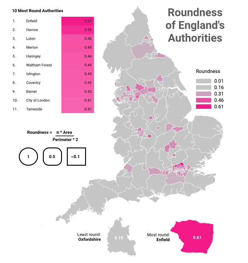
England’s authorities based on their ‘roundness’.
- Known Limitations
As all things in life, things aren’t as simple as they appear. Below are the current known limitations of using and plotting data with choromap.
- Because of something called a winding convention order raw GeoJSON files will not work. The file must be a pseudo-GeoJSON CSV file created using the method above.
- Unfortunately, BigQuery public data sets also use the same convention as GeoJSON and therefore cannot be converted easily to use with this tool.
- Both the above limitations can be resolved largely by simplifying the geometries using
ST_SIMPLIFYbut this ultimately makes the geometries more simple. For plotting this isn’t too much of an issue, but complex geometries are important for computational geometry.
Summary
This post shows how I created a community visualisation tool called choromap for Google’s Data Studio, which allows users to create choropleth maps for bespoke boundaries.
This post has also been posted to medium.