We have been using Github extensively since December 2016 for all our code and project management needs. Since then, our team has grown, along with our code-base.
I’m generally interested in devOps ⧉ and how we can automate our processes in the data science campus. As such, I’ve been looking into ways to make use of Github’s API ⧉ and meta data to extract insights from our project development life cycle.
Since we use Github for most of our projects, there exists a rich amount of data in our combined git logs. This data (code diffs and commit messages) can be used to analyse the evolution of individual projects, produce various code metrics and in general can be used to understand team interaction and cross-project collaborations.
As a starting point, I thought it would be interesting/fun to visualise the evolution of our code-base starting from the early days of the campus. After digging around a little for existing version control ⧉ analytics/ visualisation tools, I came across a real gem: Gource ⧉.
Gource (available on github ⧉) is a
OpenGL-based 3D visualisation tool for source control repositories.
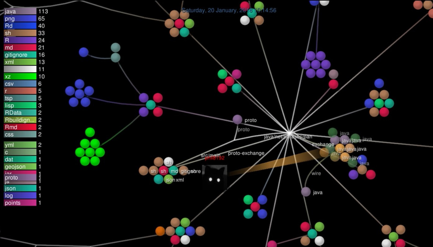
It is a visualisation tool which builds an evolving force-directed graph structure based on a project’s changing directory layout. The contributions of individual developers are shown as sprites maneuvering around file nodes whilst emitting laser beams resulting in bloom effects for each and every file modification. Lots of fun.
After a bit of scripting as to combine and clean project git logs, I ended up with this animation:
The animation shows (add, modify, delete) file interactions over time.
The individual nodes represent file directories and the leaf-nodes represent
files, colour coded by programming language. We mainly make use of Python, R,
Java, Javascript and Scala in the campus. R has slowly been overtaken by Python
for much of our work (despite my best efforts :)
In terms of insights, it is interesting to visualise the growth of our projects through time. As a team, some working patterns seem to be present with some members jumping between projects, working alone or in parallel with others.
Creating the video
Before creating the video, it is first necessary to extract a gource-specific log file. In general, with a single repository, a gource can create a log file like this:
gource --output-custom-log repo.log my-repo-location/
Gource will then use this log file to render an interactive animation, or for generating a sequence of image frames. I wanted to combine all of our repositories together as to get a higher level view. To do this, I had to do some pre-processing..
The script will clone or update the specified repositories, re-map users to
correct Github user.name (if necessary), keep only code edits (ignoring things
like markdown/.gitignore updates), download associated Github avatars for each
contributor and finally output a csv file combo.csv - should you wish to
analyse the logs in R for example.
Having combined and cleaned the logs, it’s time to fire up Gource and create the video. Here, I’ve used ffmpeg ⧉ to do the final mp4 conversion.
Note that Gource is pretty flexible and accepts a large number of parameters. Check the wiki ⧉ for more info.
Entire history of Unix
I first came across Gource after seeing the complete unix-history-repo ⧉ created by Diomidis Spinellis ⧉. The reconstructed repo, contains the entire evolution of the Unix operating system available as a Github repository. See the following fascinating paper for more details:
A repository of Unix History and evolution ⧉.
Empirical Software Engineering, 22(3):1372–1404, 2017. (http://dx.doi.org/10.1007/s10664-016-9445-5 ⧉)
Using the unix-history-repo, Landon Wilkins ⧉
has used Gource to visualise ~47 years of development.
See the original here ⧉.
I wonder how the data-science-campus code will look in 47 years!
Thanks for reading.