On every Google data studio chart, there is the option to add ‘Optional Metrics’ which adds additional metrics to the settings of any chart. However, this can cause problems with a page full of charts needing optional metrics, or if you are using community data visualizations which may not have optional metrics built in. If, for example, you wanted a single drop-down box that would filter every chart on a report including community visualizations, this would be possible using calculated fields and parameters in Data Studio. These calculated fields link together to provide a user-friendly filtering for a range of metrics at whole page level.
We’ve used custom parameters a lot within the Data Science Campus, mostly to filter charts and tables so they can be seen across multiple metrics or downloaded to a user’s needs. To demonstrate its use, we shall explore COVID-19 open data from the coronavirus dashboard. In order to show how it is built, I will set up a custom parameter to filter and choose between all COVID-19 metrics available on a basic time-series graph and bar chart.
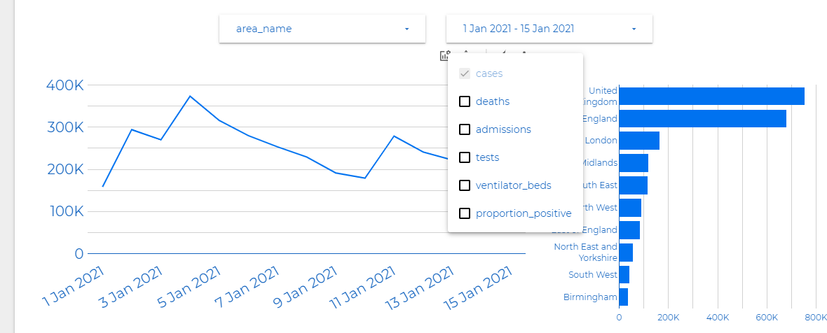
Figure 1 Two charts with metrics added via ‘optional metrics’ menu. Filtering is only allowed at one chart level.
Firstly, let’s address optional metrics and why we steered away from this built-in function. In both charts above I’ve added all the metrics to optional metrics. Within the Data Science campus, the goal of many of our Data Studio pages is to behave like a synced report, with all charts connecting via controls. As you can see above, the issue with optional metrics is you can only filter by one chart, ignoring other parts of the page and therefore not good enough for a page with more than one chart.
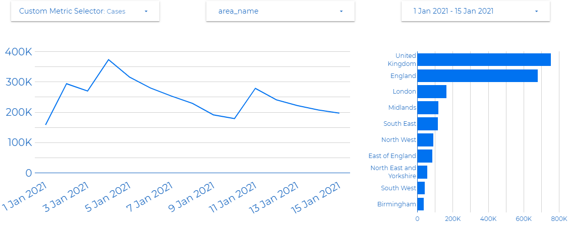
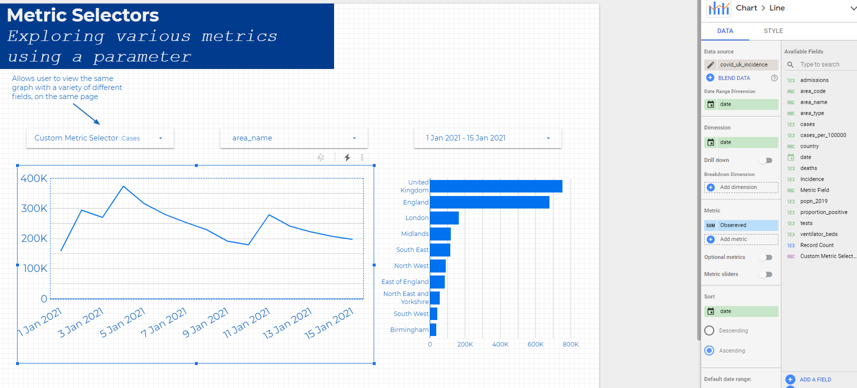
Figure 2 Two charts with a custom metric selector.
In this dashboard page, like many pages used within the Data Science Campus, a custom parameter is used to allow exploration across all charts presented. The custom parameters give the user an efficient tool to allow better understanding of the data visualisations.
How to setup custom parameters
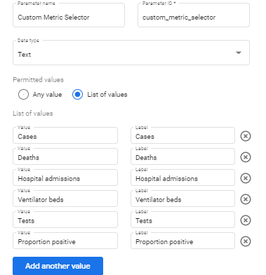
In Data Studio, the first step is to create a parameter with a list of all the metrics you want to choose between. In my example I have called it Custom Metric Selector and added the available metrics from the government dashboard.
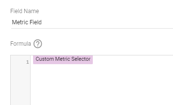
When this parameter is completed, create a calculated field that that links to the parameter by adding the created parameter as the field’s formula.
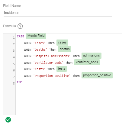
Now that the field and parameter have been created, the final calculated field is the metric that will be added to chart. It is a CASE statement that links the list in the parameter to the metrics of your dataset.
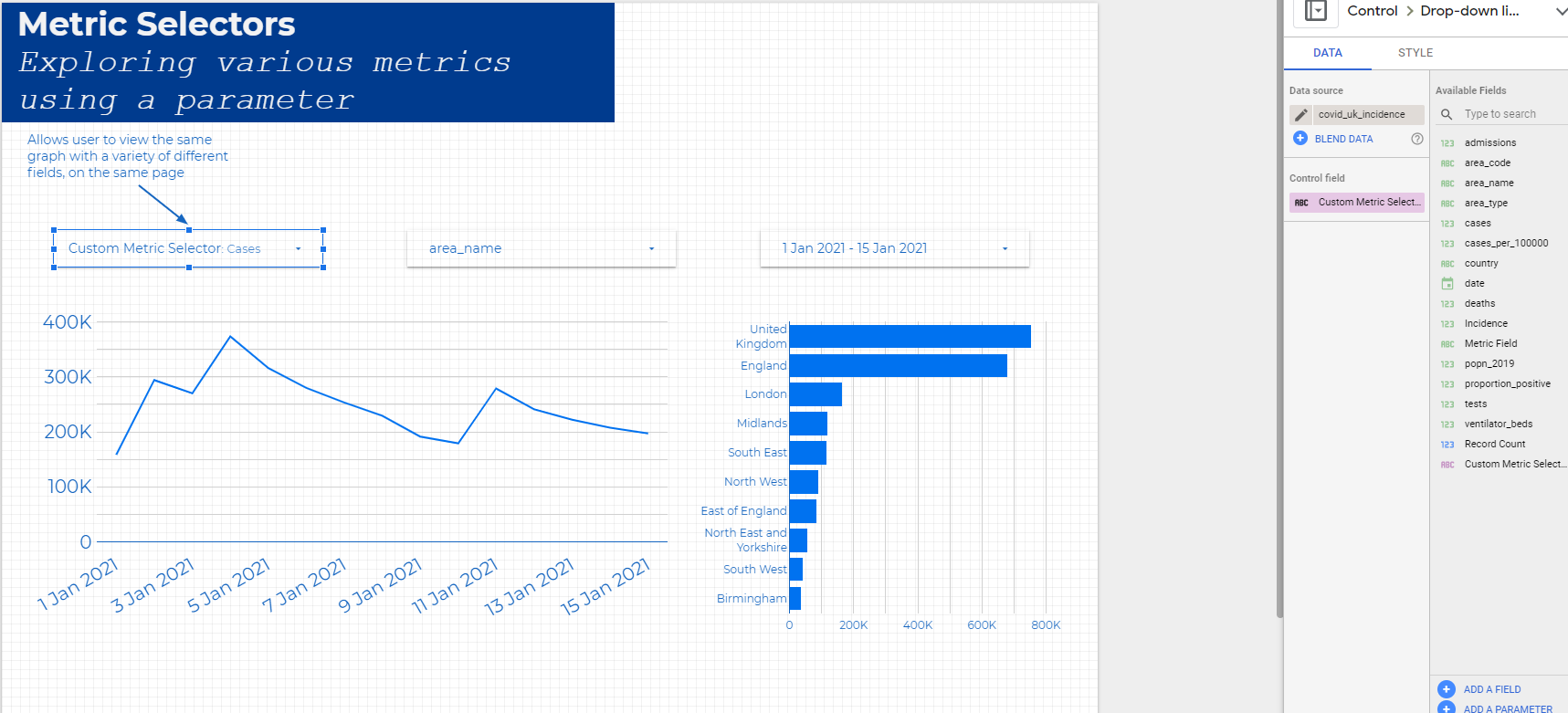
Finally, you can add these calculated fields to a page instead of normal metrics to make life easier for any user. Add the final calculated field to the metrics of a chart and add the parameter to a drop-down control filter for the custom metrics to work together on a whole page as shown below.
We have shown in this post how we can use Google Data Studio’s custom parameters in order to bypass the limitations of the optional metrics function and to be able to view multiple metrics with community visualisations. To find out more about custom parameters, take a look at Google Data Studio’s documentation. You can also explore the report described in this post.