Updates
16/04/2020: Google have released the data in CSV format. Click here for the latest data.
10/04/2020: The mobius pipeline (click here) has been updated for the Friday 10th of April 2020 release of data. This dataset comprises a time series between Sunday 23rd February 2020 and Sunday 5th April 2020. The blog post below talks about the original data set, but the methodology remains the same.
Introduction
![]()
Figure 1: mobius logo
At 7:00 am Friday 3rd April 2020, Google released Community Mobility Reports for 131 countries and 50 US states, and the District of Columbia. These reports show the changing levels of people visiting different types of locations for areas around Great Britain and other countries. The data provides insight into the impact of social distancing measures, and are created with aggregated, anonymised data from users who have turned on the Location History setting (off by default).
The reports contain headline numbers and trend graphs (Figure 3) showing how mobility has changed over time for six categories (retail and recreation, groceries and pharmacies, parks, transit stations, workplaces, and residential). The graphs comprise a daily mobility percent (%) value for between 16th February 2020 and 29th March 2020, relative to a baseline period from the 3rd January 2020 to 6th February 2020. Each report has national-level (or state-level) graphs, and a number of reports have regional-level graphs.
As these reports were released in PDF format, a team of Data Scientists at the Data Science Campus were tasked with gathering the data within the reports so that the raw data could be fed-in to inform the UK government response to Covid-19. We setup a public GitHub repository, gave the project the name mobius, and began our work.
Our first job was to get the data for Great Britain (including all 150 regions, Figure 2), which we were able to provide to colleagues across government working on the Covid-19 response rapidly. This included working with ONS Geography to generate a new geographical boundary dataset that reflected Google’s.
These datasets, among others, can be found at the Campus’ Google Mobility Reports Data GitHub repository.
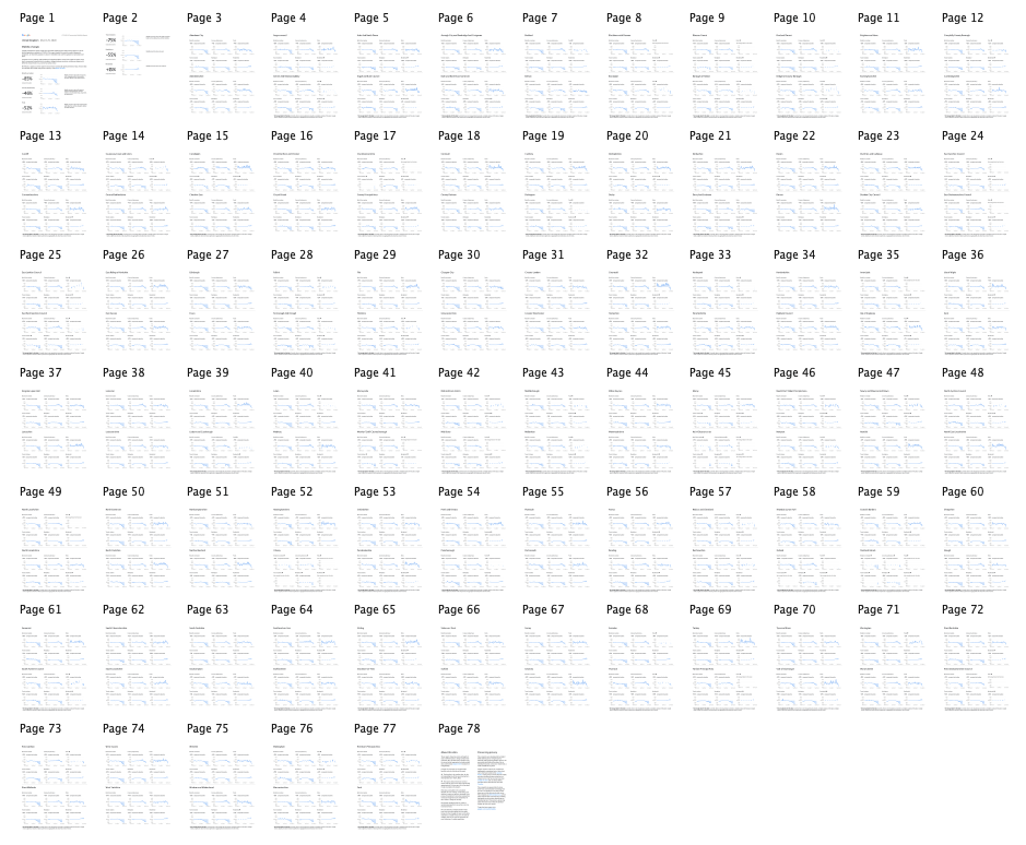
Figure 2: All 78 pages of the Great Britain (GB) Google Mobility Report. The first two pages show national-level headline numbers and graphs. Subsequent pages comprise each of the 150 regions data.
Methodology
The main task for the team was to extract the text and graphs from the PDF reports and convert the headline numbers and trend line graphs to data. In addition, the team aimed to align this data to ONS geographies for Great Britain. Crucially, the team undertook various quality assurance steps before publishing their data. This was to ensure that the data, to the best of our knowledge, was an accurate representation to that presented in the reports.
Extracting relevant elements from Scalable Vector Graphics
The graphs in the reports were embedded as vector graphics. This means they comprised a vector coordinates system that could theoretically be used to calculate the mobility % value for each data point on the graphs. Until we realised the graphs were embedded as vectors, we were also looking at how to extract trend data directly from the charts using image analysis techniques.
First, we saved a number of individual graphs to Scalable Vector Graphics (SVG) format. We chose SVG as we wanted to retain the vector information of the graph. Crucially, SVG is drawn from mathematically declared shapes and curves (Bézier curves) that keep the vital vector coordinates system we required.
We then began to inspect these SVG files to see what information we could use to calculate the original data. It was found that the most important elements of each graph were the top (80%), middle (baseline), and bottom (-80%) horizontal lines, and the trend line (Figure 3). Both had unique stroke-widths and stroke colours that meant they could be easily filtered from the rest of the SVG elements. To filter these elements the team used the python library svgpathtools. An example of a filtered SVG graph for the graph in Figure 3 is shown below.
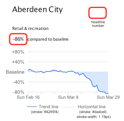
Figure 3: A graph from the GB report
<?xml version="1.0" encoding="UTF-8" standalone="no"?>
    <!DOCTYPE svg PUBLIC "-//W3C//DTD SVG 1.1//EN" "http://www.w3.org/Graphics/SVG/1.1/DTD/svg11.dtd">
        <svg width="100%" height="100%" viewBox="0 0 174 87" version="1.1" xmlns="http://www.w3.org/2000/svg" xmlns:xlink="http://www.w3.org/1999/xlink" xml:space="preserve" xmlns:serif="http://www.serif.com/" style="fill-rule:evenodd;clip-rule:evenodd;"><rect id="Artboard1" x="0" y="0" width="173.43" height="86.648" style="fill:none;"/>
        // horizontal lines below //
        <path d="M36.542,67.535l114.317,0" style="fill:none;stroke:#dadce0;stroke-width:0.29px;"/>
        <path d="M36.542,53.246l114.317,0" style="fill:none;stroke:#dadce0;stroke-width:0.29px;"/>
        <path d="M36.542,38.956l114.317,0" style="fill:none;stroke:#dadce0;stroke-width:0.29px;"/>
        <path d="M36.542,24.666l114.317,0" style="fill:none;stroke:#dadce0;stroke-width:0.29px;"/>
        <path d="M36.542,10.377l114.317,0" style="fill:none;stroke:#dadce0;stroke-width:0.29px;"/>
        // tred line below //
        <path d="M36.542,36.7l2.722,-1.62l2.722,2.065l2.722,0.986l2.721,1.113l2.722,-0.26l2.722,-0.1l2.722,-0.91l2.722,2.325l2.722,-1.166l2.721,-0.968l2.722,0.342l2.722,-0.561l2.722,-1.525l2.722,0.17l2.722,0.715l2.721,1.33l2.722,-1.502l2.722,2.046l2.722,-0.308l2.722,0.873l2.722,-1.226l2.721,-0.522l2.722,-0.248l2.722,1.104l2.722,1.897l2.722,-0.42l2.722,3.241l2.721,-1.596l2.722,-0.832l2.722,4.205l2.722,2.135l2.722,1.405l2.722,2.574l2.721,7.795l2.722,1.053l2.722,-2.437l2.722,7.716l2.722,1.389l2.722,0.461l2.721,0.062l2.722,2.397l2.722,-0.347" style="fill:none;stroke:#4285f4;stroke-width:1.14px;"/>
        </svg>
Changing vector coordinates to data values
Once the relevant elements were filtered from the SVG file(s), the team calculated a scaling metric. This scaling metric would be used to convert distances in the vector coordinate system to mobility % values. To do this, the distance between the +/- 80% lines and the baseline were used, and the average distance stored. We then calculated the distance between the trend line and the baseline in the y dimension for each vertex of the trend line. Each vertex in this case reflects a data point. Once these values had been found, the scaling value could then be used to calculate the mobility % value.
Getting data for an entire document
After we found a solution for a single graph, we needed to scale the process to calculate mobility % values for all graphs in a document.
We explored command line and python tools including pdftocairo and PyMuPDF, however, the SVGs created with these methods resulted in a number of issues. One issue is that they did not flatten the SVG image. This means that the vector coordinate system in the SVG path did not represent its true location compared to other graphs and elements of graphs. We would therefore need to use the transform matrix stored within the attributes of the SVG element to find the distances between the horizontal lines and the trend line. As data was required as soon as possible, we therefore decided against these approaches. Furthermore, for points on the graphs, these approaches did not close the path, which caused errors loading the SVG using svgpathtools.
Due to the time constraints of this work the team converted all of the PDF documents to SVG documents using Affinity Designer. Affinity Designer is a low-fee vector graphics editor developed for macOS, iOS, and Microsoft Windows. It provides an option to flatten the SVG graphs, as well as automatically closing paths (needed to maintain single data points in graphs).
The SVGs and PDFs were then uploaded to Google Cloud Platform (GCP) so we could add them to the download function in the pipeline. For the SVG documents, graphs are arranged as follows:
 ------------   ------------
| Page 1 & 2 | |  Page 3 +  |
|  1         | |  1  2  3   |
|  2         | |  4  5  6   |
|  3         | |  --------  |
|            | |  7  8  9   |
|            | |  10 11 12  |
 -----------    ------------
Thus, the first six graphs in a document were from pages one and two, and related to the national-level graphs for the six categories. The subsequent pages comprised two sets of six graphs, each set relating to a region.
Quality Assurance
In addition to developing a reusable pipeline to extract the data from the reports then team undertook comprehensive quality assurance on all the data uploaded to the Campus’ Google Mobility Reports Data GitHub repository. Whilst the team were working to include quality assurance steps within their code (see below), they used R code written by Cabinet office colleague, Matt Kerlogue. This code enabled us to extract the position number of the graph within each report, in addition to the place name and category. This code also returned the headline value for each graph which allowed us to sense-check the data being extracted from the graphs. Using this the team could flag any inconsistencies where the SVGs had been extracted in a different order, and gaps within both graphs and the extracted text due to missing data.
Adding Quality Assurance to our code
Using python, the team then developed a method to read the headline numbers in the text of the report. These numbers relate to the overall increase or decline in mobility at the end of the time series (compared to the baseline). By parsing the PDF, textual information about the region name, and category type could also be found. This information was also combined with the graph trend line dataset to provide the user with all the textual and numeric information from the reports. This information also allowed the team to automatically cross-check the data from the graph trends, and also align the extracted data with the regions it refered to.
Summary
The team at the Campus worked at speed to provide analysts from across government with data from Google’s Community Mobility PDF Reports rapidly. The team also created a public python tool so that data from any Community Mobility Report can be gathered, helping analysts from all over the world understand changes in mobility over time.
Since its release, our code and data has been used by academics, government workers and members of the public in countries around the world, such as Poland and the US. The Campus’ Google Mobility Reports Data GitHub repository contains quality checked data for all G20 countries (except Russia and China, where reports were not available).
We hope that Google releases future updates, as the community mobility profiles are a valuable addition to the data we have on mobility. Please keep an eye on our code repository for updates.

Figure 4: A GIF video of the pipeline in action (at 2x speed)