Example workflow
This notebook provides a basic example workflow for using synthgauge.
[1]:
import synthgauge as sg

%matplotlib inline
Throughout we will be using toy datasets created with the datasets.make_blood_types_df() function. The datasets describe a fabricated relationship between some physical attributes and blood types.
This function effectively wraps the sklearn.datasets.make_classification() function along with some post-processing.
[2]:
real = sg.datasets.make_blood_types_df(noise=0, seed=101)
synth = sg.datasets.make_blood_types_df(noise=1, seed=101)

print(real.head(), synth.head(), sep="\n\n")
    age  height  weight hair_colour eye_colour blood_type
0  39.0   180.0    76.0       Black      Green          A
1  48.0   178.0    82.0       Black      Brown          B
2  35.0   168.0    68.0       Black      Brown          B
3  39.0   172.0    82.0       Brown       Blue          O
4  61.0   161.0    84.0       Brown       Blue          B

    age  height  weight hair_colour eye_colour blood_type
0  35.0   169.0    79.0       Black      Brown          A
1  58.0   184.0    86.0       Brown      Brown          B
2  25.0   166.0    65.0       Black      Brown          B
3  37.0   165.0    81.0      Blonde      Brown          A
4  53.0   164.0    87.0      Blonde      Brown          B
All synthgauge workflows revolve around a central Evaluator class which holds the real and synthetic data.
[3]:
evaluator = sg.Evaluator(real, synth)
We can then use in-built methods to see summary statistics of the data.
[4]:
evaluator.describe_categorical()
[4]:
| count | unique | most_frequent | freq | |
|---|---|---|---|---|
| blood_type_real | 1000 | 4 | O | 374 |
| blood_type_synth | 1000 | 4 | A | 588 |
| eye_colour_real | 1000 | 3 | Brown | 643 |
| eye_colour_synth | 1000 | 3 | Brown | 664 |
| hair_colour_real | 1000 | 4 | Brown | 468 |
| hair_colour_synth | 1000 | 4 | Brown | 460 |
[5]:
evaluator.describe_numeric()
[5]:
| count | mean | std | min | 25% | 50% | 75% | max | |
|---|---|---|---|---|---|---|---|---|
| age_real | 1000.0 | 41.792 | 8.465483 | 16.0 | 36.0 | 41.0 | 47.0 | 77.0 |
| age_synth | 1000.0 | 41.477 | 10.198013 | 8.0 | 34.0 | 41.0 | 48.0 | 81.0 |
| height_real | 1000.0 | 173.879 | 8.704029 | 149.0 | 168.0 | 174.0 | 180.0 | 204.0 |
| height_synth | 1000.0 | 173.786 | 10.733378 | 144.0 | 166.0 | 173.0 | 181.0 | 210.0 |
| weight_real | 1000.0 | 78.265 | 9.952579 | 47.0 | 72.0 | 79.0 | 85.0 | 113.0 |
| weight_synth | 1000.0 | 78.424 | 11.463666 | 42.0 | 71.0 | 79.0 | 86.0 | 116.0 |
Plotting
The Evaluator class has several methods to visually compare the real and synthetic data. Below are a few examples.
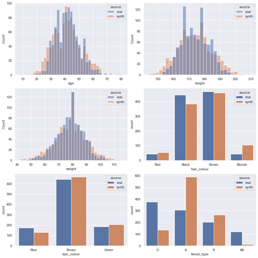
The plot_histograms() method allows us to look at the univariate distribution of the features.
[6]:
evaluator.plot_histograms(figsize=(12, 12));
The plot_correlation() method lets us look at the relationships between pairs of variables. The third plot shows the difference between the correlation scores.
[7]:
evaluator.plot_correlation(
    feats=["hair_colour", "eye_colour", "blood_type"],
    method="cramers_v",
    figsize=(15, 6),
    figcols=3,
    annot=True,
);
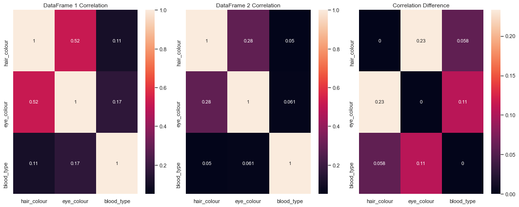
Here, we can see that the features hair_colour and eye_colour seem to have the biggest differences between their correlation in the real dataset and in the synthetic dataset.
We can use the plot_crosstab() method to investigate this further.
[8]:
evaluator.plot_crosstab(
    "hair_colour",
    "eye_colour",
    figsize=(8, 4),
    cmap="light:coral",
    annot=True,
    fmt="d",
);
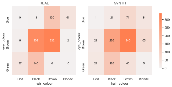
From this plot, we can see that there are some particular two-way counts throwing our correlation coefficients off. For instance, brown-eyed blondes are oversampled and blue-eyed brunettes are undersampled in the synthetic data.
Metrics
We can also evaluate the synthetic data empirically using metrics.
These first need to be added to the evaluator before running the evaluate() method. To add these metrics, we use the add_metric() method, specifying the metric name (and optional alias) followed by keyword arguments that will be passed to the metric function.
We can use for-loops to add several similar metrics efficiently, like the feature-specific Wasserstein and Jensen-Shannon distances below.
[9]:
# univariate distribution comparisons
for feat in ("age", "height", "weight"):
    evaluator.add_metric("wasserstein", alias=f"wass-{feat}", feature=feat)

for feat in ("hair_colour", "eye_colour", "blood_type"):
    short = feat.split("_")[0]
    evaluator.add_metric(
        "jensen_shannon_distance",
        alias=f"jenshan-{short}",
        feature=feat,
        bins=None,
    )

# correlation
evaluator.add_metric("correlation_msd", alias="pearson-msd")
evaluator.add_metric("correlation_msd", alias="cramers-msd", method="cramers_v")

# distinguishability
evaluator.add_metric("propensity_metrics")

evaluator.evaluate(as_df=True)
[9]:
| value | |
|---|---|
| wass-age | 1.329000 |
| wass-height | 1.469000 |
| wass-weight | 1.147000 |
| jenshan-hair | 0.089442 |
| jenshan-eye | 0.044969 |
| jenshan-blood | 0.281916 |
| pearson-msd | 0.021031 |
| cramers-msd | 0.022921 |
| propensity_metrics-pmse | 0.244583 |
| propensity_metrics-pmse_standardised | 0.256155 |
| propensity_metrics-pmse_ratio | 1.000699 |
More details about the specific metrics can be found in the API Reference or by using the help function.
[10]:
help(sg.metrics.univariate.wasserstein)
Help on function wasserstein in module synthgauge.metrics.univariate:

wasserstein(real, synth, feature, **kwargs)
    The (first) Wasserstein distance.

    Also known as the "Earth Mover's" distance, this metric can be
    thought of as calculating the amount of "work" required to move from
    the distribution of the synthetic data to the distribution of the
    real data.

    Parameters
    ----------
    real : pandas.DataFrame
        Dataframe containing the real data.
    synth : pandas.DataFrame
        Dataframe containing the synthetic data.
    feature : str
        Feature of the datasets to compare. This must be continuous.
    **kwargs : dict, optional
        Keyword arguments for `scipy.stats.wasserstein_distance`.

    Returns
    -------
    float
        The computed distance between the distributions.

    See Also
    --------
    scipy.stats.wasserstein_distance

    Notes
    -----
    This is a wrapper for `scipy.stats.wasserstein_distance`.
    Computationally, we can find the Wasserstein distance by calculating
    the area between the cumulative distribution functions for the two
    distributions.

    If :math:`s` is the synthetic feature distribution, :math:`r` is the
    real feature distribution, and :math:`R` and :math:`S` are their
    respective cumulative distribution functions, then

    .. math::

        W(s, r) = \int_{-\infty}^{+\infty} |S - R|

    The distance is zero if the distributions are identical and
    increases as they become less alike. This method is therefore good
    for comparing multiple synthetic datasets, or features within a
    dataset, to see which is closest to the real. However, as this is
    not a test, there is no threshold distance below which we can claim
    the distributions are statistically the same.

    Examples
    --------
    >>> import pandas as pd
    >>> real = pd.DataFrame(get_real(500),
    ...                     columns = ['feat1', 'feat2', 'feat3'])
    >>> synth = pd.DataFrame(get_synth(500),
    ...                      columns = ['feat1', 'feat2', 'feat3'])

    The first feature appears to be more similar than the second across
    datasets.

    >>> wasserstein(real, synth, 'feat1')
    0.0688192355094602 # random
    >>> wasserstein(real, synth, 'feat2')
    0.8172329918412307 # random
It is possible to also add user-defined metrics to an Evaluator.
The custom_metric() method takes as input a name to be displayed in the results table and a function whose first two arguments are the real and synthetic datasets, respectively.
As with any of the implemented metrics, keyword arguments for the custom metric function can be specified in the custom_metric() call.
[11]:
from scipy.stats import skew


def skew_difference(real, synth, feature):
    """Calculate the absolute difference in skew for a feature."""

    real_skew = skew(real[feature])
    synth_skew = skew(synth[feature])

    return abs(real_skew - synth_skew)


evaluator.add_custom_metric("skew-diff-age", skew_difference, feature="age")
evaluator.evaluate(as_df=True)
[11]:
| value | |
|---|---|
| wass-age | 1.329000 |
| wass-height | 1.469000 |
| wass-weight | 1.147000 |
| jenshan-hair | 0.089442 |
| jenshan-eye | 0.044969 |
| jenshan-blood | 0.281916 |
| pearson-msd | 0.021031 |
| cramers-msd | 0.022921 |
| propensity_metrics-pmse | 0.244833 |
| propensity_metrics-pmse_standardised | 0.880363 |
| propensity_metrics-pmse_ratio | 1.002713 |
| skew-diff-age | 0.074001 |
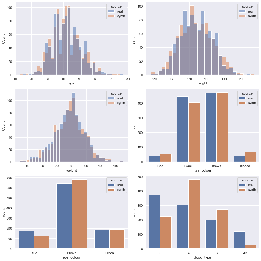
Comparing with another dataset
The functionality of synthgauge makes it easy to compare different synthetic datasets.
It’s as simple as:
Creating another
Evaluatorobject with the new synthetic datasetRunning the plotting methods
Copying and running the metrics from the first evaluator via the
copy_metrics()andevaluate()methods
[12]:
synth_comparison = sg.datasets.make_blood_types_df(noise=0.5, seed=101)

comparison_evaluator = sg.Evaluator(real, synth_comparison)
[13]:
comparison_evaluator.plot_histograms(figsize=(12, 12));
[14]:
comparison_evaluator.copy_metrics(evaluator)
comparison_evaluator.evaluate(as_df=True)
[14]:
| value | |
|---|---|
| wass-age | 0.412000 |
| wass-height | 0.507000 |
| wass-weight | 0.344000 |
| jenshan-hair | 0.047795 |
| jenshan-eye | 0.046605 |
| jenshan-blood | 0.198479 |
| pearson-msd | 0.002585 |
| cramers-msd | 0.004842 |
| propensity_metrics-pmse | 0.244083 |
| propensity_metrics-pmse_standardised | 0.494213 |
| propensity_metrics-pmse_ratio | 1.001590 |
| skew-diff-age | 0.017955 |
[ ]: